
When couples decide to commission a custom story map keepsake, their primary hesitation is almost never about the paper or the aesthetic. It is about curation paralysis. We regularly hear from partners asking: “Do we have enough travel destinations? Are our local hangouts too ordinary to frame on a wall? How do we fit an apartment in Brooklyn, a road trip breakdown in Oregon, and a wedding in Maine onto a single balanced layout without it looking cluttered?”
The short answer is that meaningful cartography does not require an exotic international passport. In our studio, we have learned that the quietest, most unassuming locations frequently carry the deepest emotional weight. A custom relationship map is not an atlas or a tourist brochure; it is an architectural record of where two lives changed course. When you understand how to select, edit, and format your shared geography, designing personalized relationship map ideas becomes a rewarding, creative process.
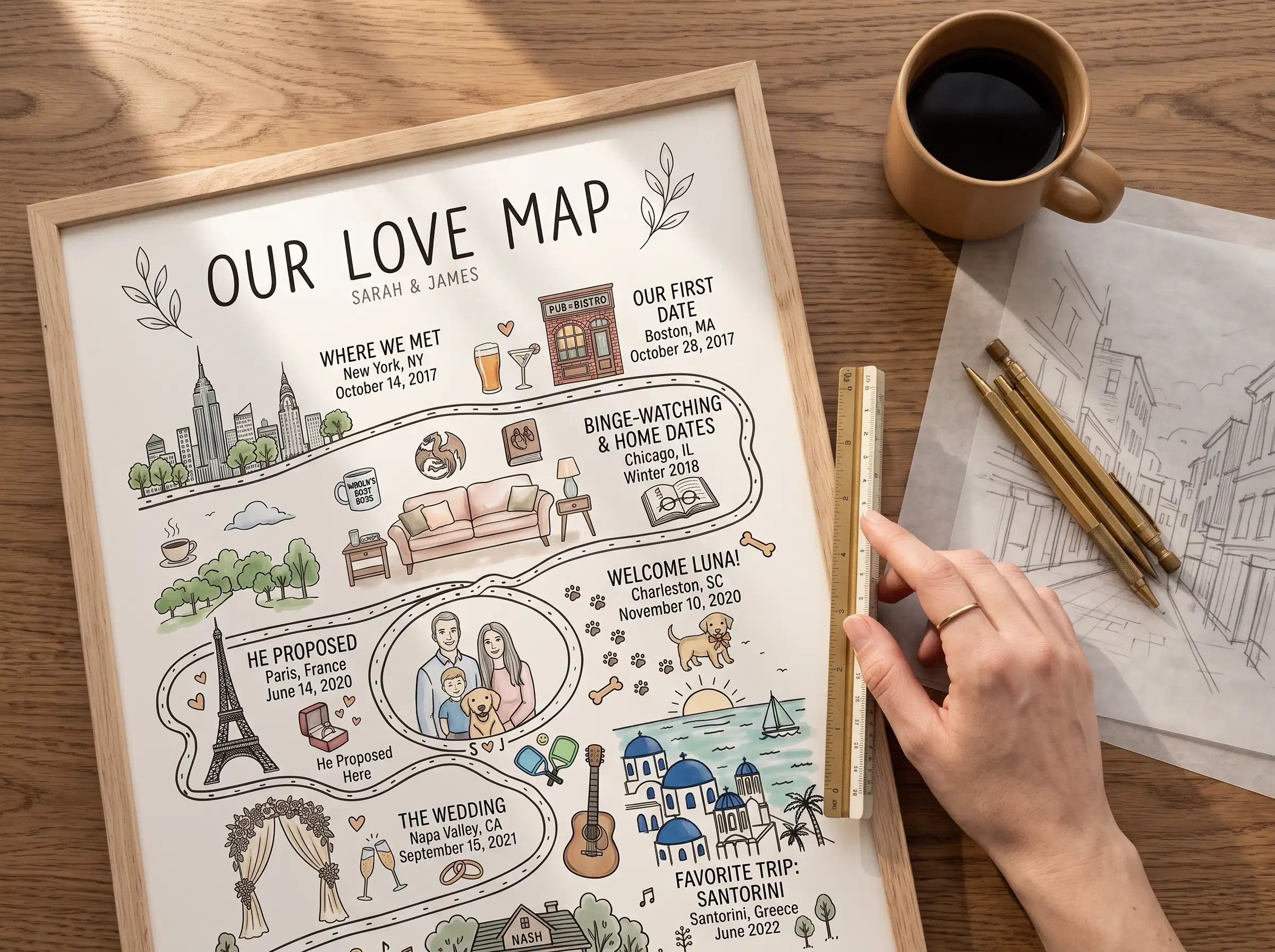
The Fourteen-Pin Dilemma: A Studio Story from Liam and Zoe
Last month, a client named Liam submitted an order with fourteen distinct locations. He and his partner, Zoe, had listed every Airbnb from their five years together, the airport terminal where their flight was delayed twelve hours, their college dorms, three different bars, and a park where they had one afternoon picnic. To make matters worse, Liam had typed a three-sentence paragraph beneath every single coordinate.
Liam had initially previewed this layout on an automated map generator online, and the result was an unreadable disaster: the fourteen map circles shrank to the size of postage stamps, highway shields were sliced in half by the borders, and the long paragraphs of text turned into an illegible gray smudge across the bottom of the sheet. Liam messaged our studio: “Can you make this look like art, or are we trying to do too much?”
Maya and Daniel got on an email exchange with Liam that afternoon. Daniel gently explained the principle of editorial hierarchy: when you emphasize everything, you emphasize nothing. Together, they distilled the fourteen random stops down to four structural pillars: the rain-soaked coffee shop in Portland where they first met, the highway shoulder in Big Sur where their radiator blew and they spent three hours laughing in the car, the snowy overlook in Tahoe where Liam proposed, and their Craftsman bungalow in Denver where they live today.
Maya then reformatted their lengthy text blocks using our studio’s Three-Line Rule, pairing concise titles with exact latitude and longitude coordinates. When Liam shared the 24-hour proof with Zoe, she messaged us immediately: “We thought we needed every single vacation on the page to prove our history. But seeing just those four anchors gave our relationship actual dignity.”
The Four-Anchor Framework: Editing Your Timeline
When curating stops for a multi location story map, resist the temptation to build an exhaustive travel diary. Visual storytelling derives its power from focus. Most couples find that four core anchors create the most compelling visual rhythm:
- The Origin Ground: The accidental crossroads where your paths first crossed. It might be a noisy college cafeteria, a subway exit, or the neighborhood pub highlighted through a dedicated Where It All Began Map.
- The Shared Adventure: The trip, detour, or temporary town where you first realized you worked seamlessly as a team under pressure.
- The Commitment Coordinate: The coastal cliff, botanical garden, city hall steps, or living room rug where you decided on a shared future.
- The Current Anchor: The front door of the home you share today—the kitchen where morning coffee is brewed and weekday routines unfold, which can also be documented with a tailored First Home Map.
Turn Your Shared Ground into Fine Art
Curate your defining relationship chapters into a bespoke cartographic print. Hand-typeset by our studio with proofs delivered in 24 hours.
Explore Our Love MapThe Three-Line Typographic Rule: Avoiding Clutter
In graphic design, typography must respect the medium. Street maps are naturally intricate networks of fine lines, water contours, and grid intersections. When you crowd long narrative paragraphs underneath a map panel, the text competes with the linework, creating visual fatigue.
In our studio, Maya formats custom subtitles using a disciplined three-line hierarchy:
- Line 1 (The Milestone): An evocative title set in clean letterforms (e.g., The First Hello / Where We Decided / The Front Door Keys).
- Line 2 (The Specific Locale): The neighborhood and city (e.g., Lincoln Park, Chicago / Cannon Beach, Oregon).
- Line 3 (The Anchor Metric): The exact calendar date, season, or precise latitude and longitude coordinates.
If your story centers on the quiet progression of your domestic life within a single beloved city, our focused Map of Us layout applies this exact typographic discipline across neighborhood walking paths.
Cartographic Balance: Scale, Density, and Negative Space
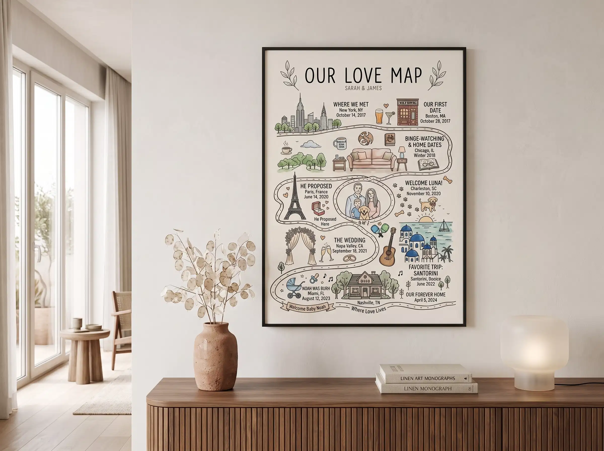
Automated online map generators make a glaring mistake when formatting places we’ve been map for couples: they apply an identical zoom level to every address. If your first date was in dense downtown Manhattan and your proposal was on an open beach in Maine, an automated script will render Manhattan as an overwhelming block of black ink while turning Maine into an empty, lonely dot.
In our studio, Daniel and Maya manually balance the optical weight of every panel. We widen the viewing perimeter on dense urban centers so the grid breathes, while tightening the scale on rural locations to highlight natural shorelines, country lanes, and riverbanks. This manual adjustment ensures that each chapter carries equal visual dignity side by side on your wall.
Within 24 hours of placing your order, we send a digital proof directly to your email inbox. You can review the crop margins, double-check coordinate numbers, verify dates, and request unlimited free revisions before your piece ever moves to print.
Frequently Asked Questions
What if a location does not have a formal street address?
You do not need a street number. Many of the most memorable milestones happen at a scenic overlook, a beach cove, a music festival campsite, or an unnamed trail summit. Simply supply nearby cross streets, a park name, or rough coordinates. Maya will manually cross-reference satellite imagery to ensure the pin drops on the precise square yard you remember.
Can we combine international cities and domestic hometowns on one map?
Yes. Many couples have chapters scattered across different states and foreign countries. Because Daniel calibrates the scale of each panel individually, an international destination like Florence or Tokyo harmonizes seamlessly beside a small rural town in North Carolina.
How many locations work best on a custom story map?
Three to five locations provide the ideal balance between rich storytelling and clean negative space. If you have more than five milestones, we can expand to six or eight panels by adjusting print dimensions to keep street labels sharp and uncluttered.
Can I adjust the text or zoom crop after receiving my digital proof?
Yes. Every order includes unlimited free revisions. When your digital proof arrives within 24 hours, you can reply directly to the email with any requested tweaks to typography, dates, or map framing. We never print or frame your artwork until you have given your explicit approval.
Written by Maya, Co-Founder and Lead Designer at Map of Our Story. Designing thoughtful milestone keepsakes since 2017.