
What determines whether an anniversary gift stays displayed permanently in a living room for twenty years or ends up tucked inside a storage closet within six months? The distinction rarely comes down to cost. Most anniversary presents prioritize convenience, novelty, or social obligation. Laser-engraving two initials onto a cheap bamboo cutting board or stamping wedding coordinates onto a mass-produced stainless steel tumbler does not make an object an heirloom. It makes it warehouse merchandise.
When partners search for personalized anniversary gifts that aren’t tacky, they are usually exhausted by the flood of marketplace novelties. True personalization is not about branding a blank factory item with your names. It is about recognition: presenting an object that quietly acknowledges the unrepeatable terrain you have crossed together. Over years of partnership, couples accumulate private markers that mean nothing to outsiders but everything to themselves. A custom piece of cartographic art takes those crossroads and translates them into architectural wall art that honors your shared history with dignity.
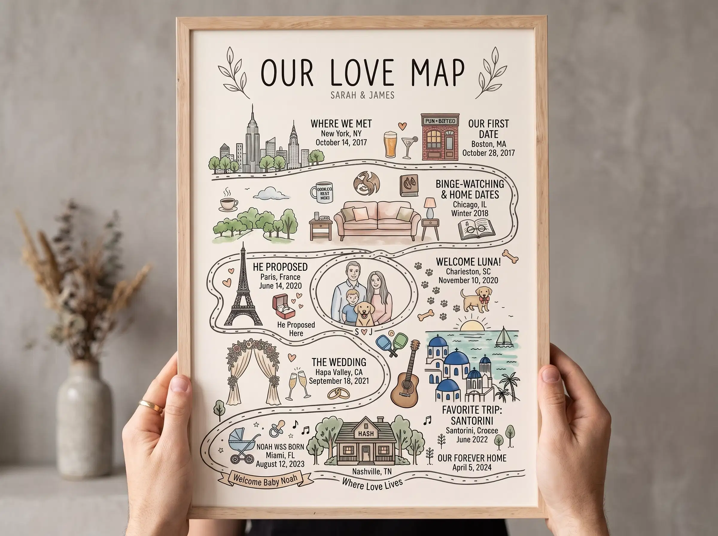
The 4th Avenue Bus Stop: Marcus and Alicia’s Anti-Kitsch Keepsake
Last spring, a customer named Marcus reached out to our design studio ahead of his fourth wedding anniversary with his wife, Alicia. For their third anniversary, Marcus had ordered an engraved wooden plaque featuring looping script fonts and cartoon heart icons. It had spent the past year hidden in a spare room closet: “Alicia loves our memories, but she hated that plaque. It looked like something from a roadside craft stall. Our home is modern, filled with mid-century furniture and clean lines. Putting our names on a novelty plaque felt childish. I want a piece of art that looks like it belongs in a design gallery, but holds the real moments that got us here.”
Marcus wanted to commemorate three very specific, unglamorous locations: a rainy bus shelter on 4th Avenue in Seattle where they had an argument, missed the bus, ate late-night street food, and realized they were falling in love; the hospital courtyard where Alicia passed her medical licensing exams; and their first shared walkup flat. When Marcus had tested automated online map tools, the software automatically generated busy, generic city tiles stamped with oversized red pushpins and forced a messy decorative font over the road lines.
Maya and Daniel brought Marcus’s coordinates onto their design board. Maya stripped away all novelty clutter, framing the 4th Avenue intersection with clean, precise vector lines and generous negative space. Daniel typeset the baseline using a disciplined, structural serif typeface with wide letter-spacing: the neighborhood name, the exact decimal coordinates, and the date. No cartoon banners, no cursive slogans.
Alicia hung the framed print in their main living room above a teak sideboard. Marcus messaged us two weeks later: “When our friends come over for dinner, they think it’s an architectural transit study of Seattle. Only when they step close do they see the bus stop coordinates and ask about it. It’s our private history hiding in plain sight.”
The Anatomy of Non-Tacky Personalization: Three Design Rules
Personalized wall art often gets an unfair reputation for looking cheap. Mass-market manufacturers rely on predictable decorative tropes that clash with mature interior decor. In our studio, we approach thoughtful anniversary gifts for couples through three foundational graphic design principles:
- Editorial Typography Over Faux-Calligraphy: Looping, decorative brush scripts date an interior instantly and create visual noise against intricate street grids. We use timeless serif and clean architectural grotesque typefaces rooted in traditional book design and cartographic publishing.
- Negative Space as an Emotional Buffer: In cartography, what you leave empty is as vital as what you label. Leaving generous, quiet margins around a location pin gives the eye room to pause, transforming geographic data into fine art.
- Micro-Scale Geographic Truth: A generic citywide map turns your history into a massive highway network. By manually calibrating the zoom to street-level intersections and neighborhood parks, the artwork reflects the actual pedestrian scale where your life unfolded.
Commission an Anniversary Keepsake with Architectural Restraint
Preserve your defining relationship coordinates on museum-grade archival paper. Designed by human typographers with digital proofs in 24 hours.
Explore Our Love MapThe Insider Code: Why Subtlety Creates Longevity
The greatest strength of custom personalized anniversary wall art is subtlety. An art print that screams sentimental declarations from across the room feels performative. But an understated cartographic print functions on two distinct levels:
To a casual guest visiting your home, the artwork reads as a striking, minimalist modern city study that complements your furniture, lighting, and interior color palette. But to you and your partner, those fine vector lines and micro-coordinates serve as an intimate insider code. Every time you walk past on a quiet Tuesday morning, you see the exact physical ground where your partnership took root.
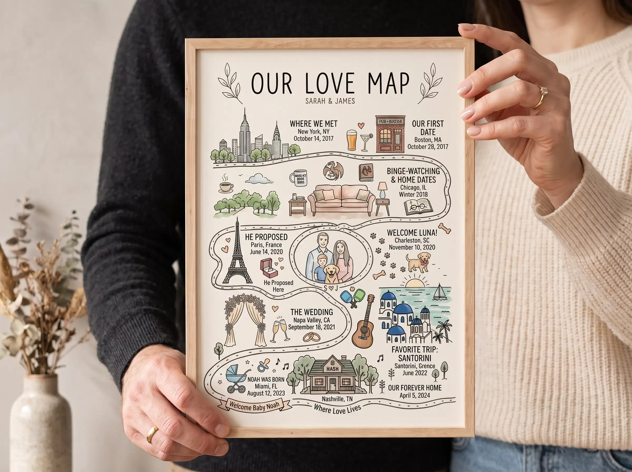
Whether you choose to chronicle an entire journey across multiple milestones through our multi-panel Our Love Map or commemorate your wedding vows using a dedicated Wedding Anniversary Map, disciplined design ensures your artwork matures alongside your home.
Studio Curation vs. Automated Factory Queues
The primary reason online personalized gifts feel tacky is automation. Most marketplace sellers rely on automated software scripts: you type an address into a form, an algorithm scrapes a generic map tile, stamps an oversized pin in the exact center, and routes the raw file directly to a factory print queue without a designer ever evaluating the composition.
In our studio, Maya and Daniel treat every order as a bespoke design commission. We manually balance street density, adjust viewport elevations so waterfronts and parks frame the composition naturally, and hand-align your custom typographic captions. Within 24 hours of placing your order, we send a high-resolution digital proof directly to your email inbox. You can review the crop, verify the coordinates, check the spelling, and request unlimited free revisions before your artwork touches archival paper.
Frequently Asked Questions
Why does your studio avoid script fonts and decorative icons?
We design our maps to function as timeless fine art prints that blend naturally into sophisticated home interiors. Script fonts and novelty cartoon icons date quickly and clash with modern decor. By utilizing disciplined architectural serif and clean sans-serif typography, we ensure your artwork remains as visually compelling twenty years from now as it is today.
What locations work best for a meaningful anniversary map?
The most powerful milestone selections avoid generic tourist spots and focus on personal turning points: the unpretentious coffee house where an awkward first conversation happened, the cramped starter apartment where you lived on takeout, or the quiet park bench where you decided on a future together.
Can I preview and adjust the layout before it goes to print?
Yes. Every order receives a digital proof delivered via email within 24 hours. You have complete freedom to inspect the street framing, adjust zoom levels, and refine your custom titles or dates with unlimited free revisions before we begin production.
How quickly will my custom anniversary piece arrive?
Once you review and approve your digital design proof, printing on heavyweight archival matte paper and custom framing takes 2 to 3 business days. All orders ship with tracked domestic delivery in reinforced protective cartons, arriving ready to hang on your wall.
Written by Maya and Daniel, Founders and Designers at Map of Our Story. Handcrafting bespoke geographic relationship art since 2017.